How to Make a Graph in Google Slides (Easiest Way in 2025)
In this tutorial, we will show you exactly how to create a graph in Google Slides in just a few simple steps. Read on to learn more.

Make a Graph on Google Slides
Follow the steps below to create graphs on Google Slides.
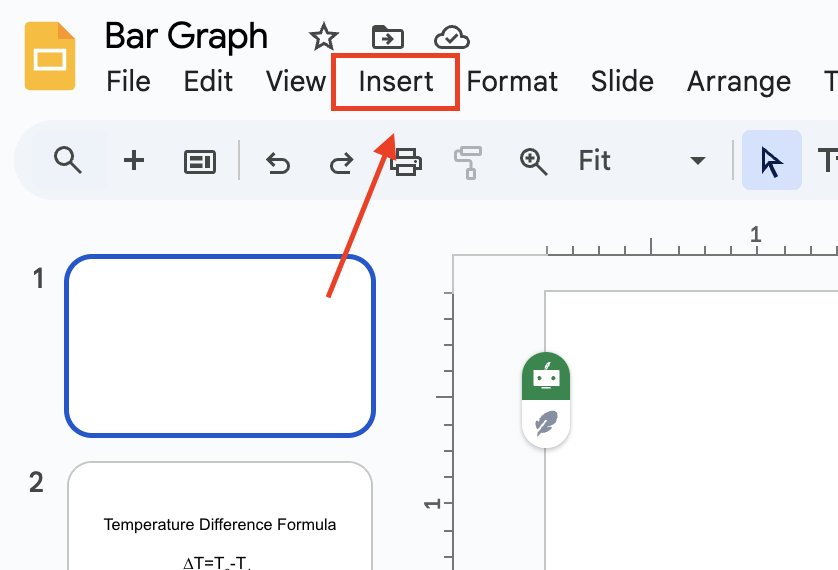
1. Open the Insert Menu in Google Slides
Go to the top menu bar and click on “Insert.” This menu lets you add different elements to your slide, including charts, text, and images.
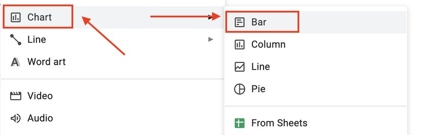
2. Insert a Bar Graph from the Chart Options
Hover over “Chart” in the dropdown menu. A side menu will appear with different options. Click on “Bar” to insert a sample bar graph onto your slide.
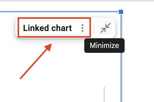
3. Open the Linked Google Sheets File to Edit Data
Once the bar graph appears on your slide, you’ll see a three-dot icon in the top-right corner.
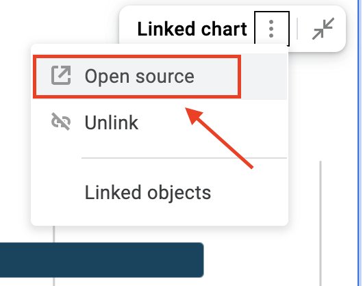
Click it and select “Open source” to open the graph’s data in Google Sheets.
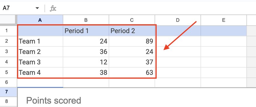
4. Replace Sample Data in Google Sheets with Your Own
Google Sheets will open with default sample data. Replace the sample values with your own. Each row represents a category, and each column represents a data series. The graph updates automatically as you make changes.
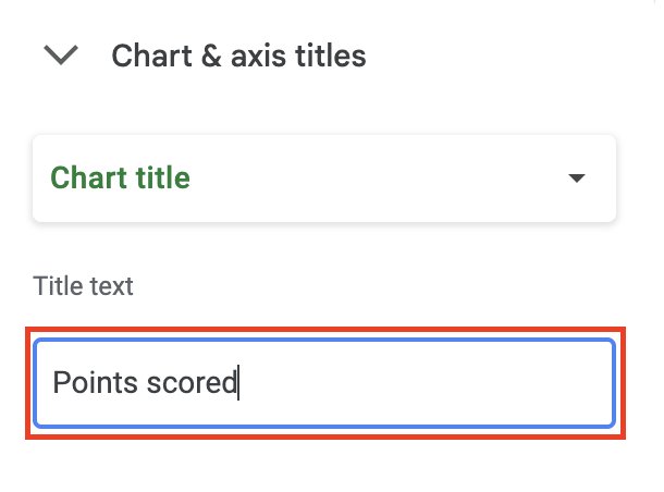
5. Modify Titles, Labels, and Colors in Google Sheets
Double-click on the chart title to rename it.
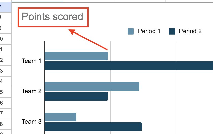
Enter the title of your graph here.
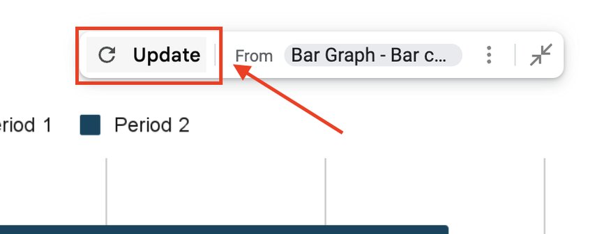
6. Return to Google Slides and Click “Update” to Apply Changes
Go back to your Google Slides presentation. Click the “Update” button that appears on the graph. This refreshes the graph with your new data from Google Sheets.
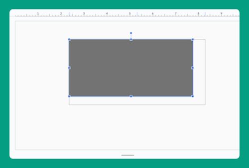
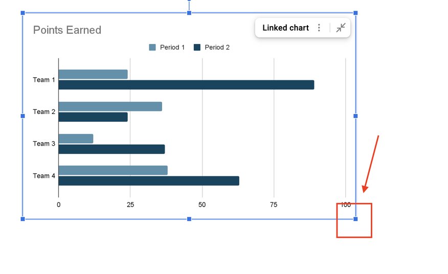
7. Resize and Move the Bar Graph for Better Placement
Click on the bar graph in Google Slides. Use the blue handles on the corners to resize it. Drag the entire graph to reposition it anywhere on your slide.
We hope that you now have a better understanding of how to make a graph using Google Slides. If you enjoyed this article, you might want to check our article on how to put Google Slides on a flash drive.